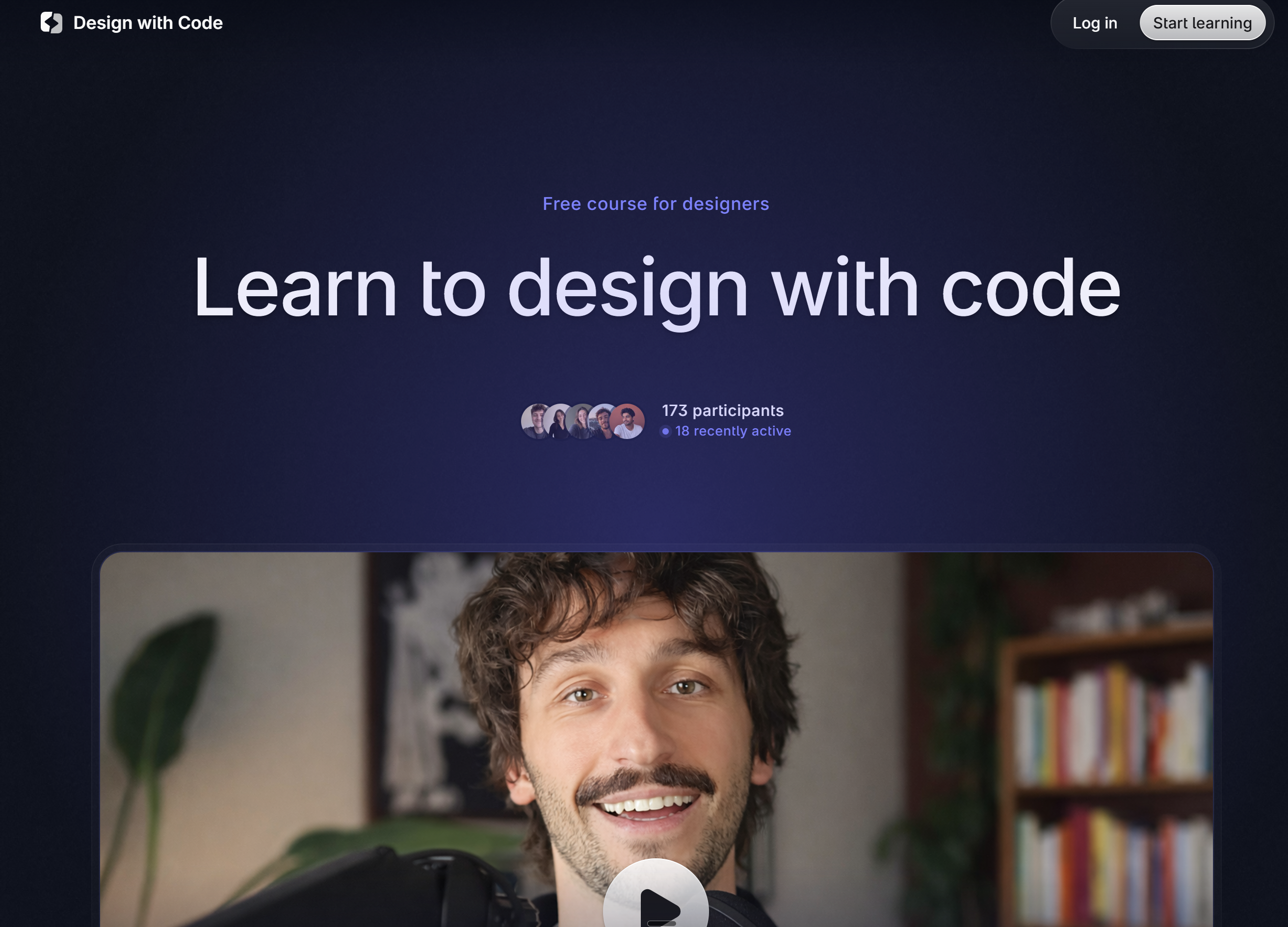
One UX Writer. Two AI tools. Level 10 Demon of Procrastination — final battle.
ClientPersonal project
Year2026
My roleDesigner, developer, writer
Tools
Claude Design Claude Code Astro Tailwind Git Netlify Cloudflare
Results
59%
reduction in codebase size after migrating to Astro — no optimisation, just the right tool
One
solo owner — from discovery to maintenance
Zero
templates, builders, or frameworks used in v1
Why a custom site at all
I have been working with content for over 10 years.
At some point I decided that if I'm going to position myself properly on the market, I need a portfolio that I own completely.
My domain. My code. And my rules.
The first question was hosting. I spent some time evaluating options — a private server (Mikrus), GitHub Pages, Netlify. I ended up on Netlify: free plan, deploy straight from Git, custom domain, HTTPS out of the box. The hosting had to be invisible. The site was supposed to be a business card, not a tutorial on how I built a business card.
One me. Two AI tools.
I used Claude as my design partner instead — specifically Claude Design for wireframing and Claude Code for building.
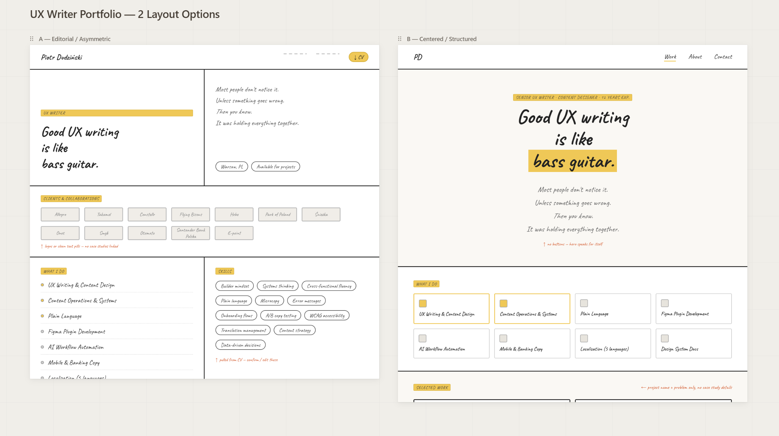
Wireframing in Claude Design was fast and ruthlessly content-focused. I prompted for clean HTML with no styles — just semantic structure. No colours, no typography, no spacing. Just: what goes where, and why. It turned out that wireframing in raw HTML is faster than Figma if you care about content hierarchy rather than pixel perfection. Especially if you are not a UI designer.
And when you're the designer and the developer and the copywriter all at once, there's no handoff to design for. The wireframe was an artefact for my own decision-making.
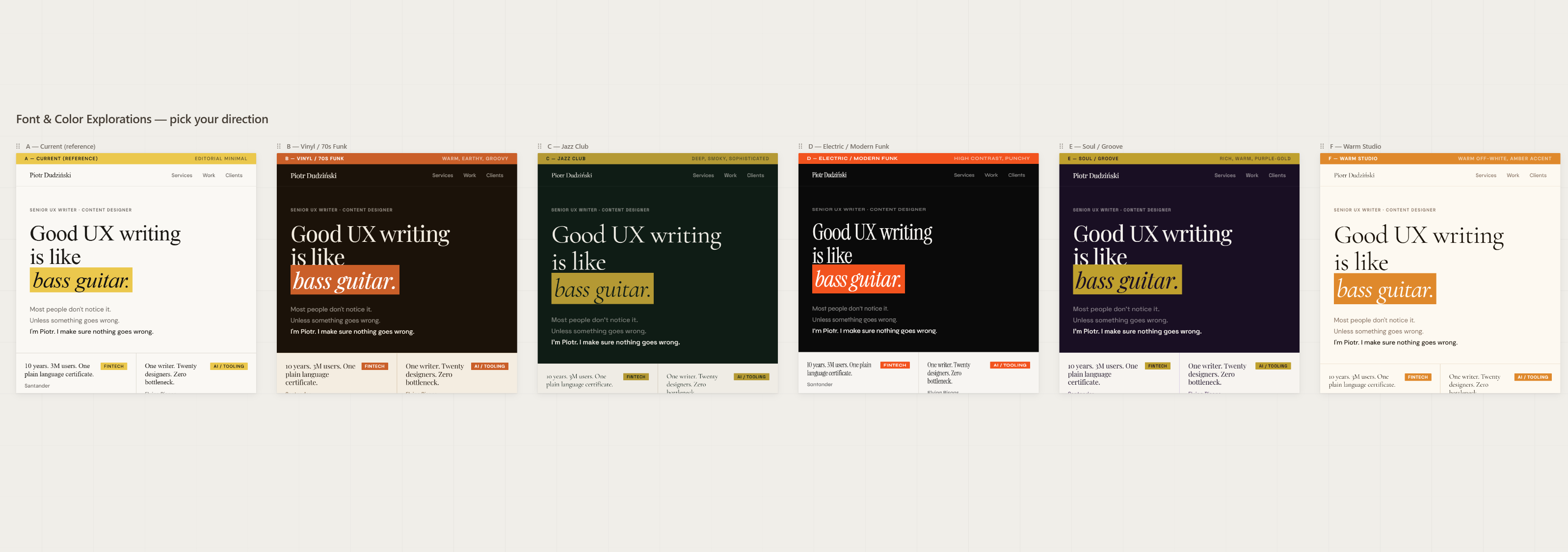
Early wireframe — structure and hierarchy before any visual decisionsFont and colour exploration — finding the visual voice early in the process
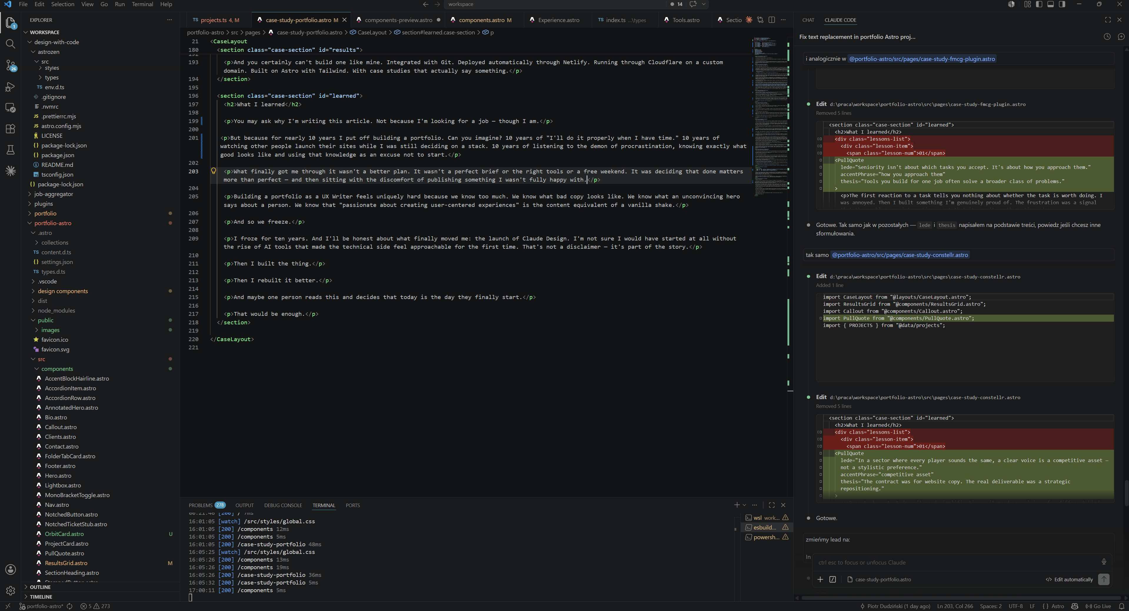
Once I had a structure I believed in, I moved to Claude Code for the actual build. This is where the real work began.
Claude Code runs directly in VS Code. Almost the entire of my workflow lived in one place. I'd describe a problem in the terminal, get code back, see it update in the browser preview, commit to Git, and watch Netlify deploy automatically within seconds. The loop was tight enough that it felt like pair programming rather than prompting.
I came into this project thinking Git was a developer tool. I left understanding it's a safety net for anyone who makes decisions. Every meaningful change was a commit. At one point a single commit saved the project — I'd broken something I couldn't easily reconstruct, and git checkout brought it back in ten seconds. The Git log also became an honest timeline of the whole project: you can see exactly when decisions were made, reversed, or replaced with better ones.
From GitHub, every push triggered an automatic deploy to Netlify. I'd hit save, wait fifteen seconds, and the live site was updated. It's called continuous deployment.
My domain runs through Cloudflare. This sits between the domain and Netlify and handles caching, SSL, and a layer of performance optimisation I didn't have to configure manually. It also meant I had analytics without adding any tracking scripts to the site itself.
“Netlify's free plan comes with a build credits limit. Every push to GitHub triggers a deploy, and every deploy costs 6 credits. Committing locally is free. It's the push that kicks off the build. You don't need to push just to preview your changes. Install the Live Server extension in VS Code and you get an instant local preview that updates as you save — no push, no deploy, no credits spent. It's faster than waiting for Netlify to build, and completely free. Push to production when something is genuinely ready, not every time you tweak a margin.”
I described problems in plain language, not in CSS or JavaScript. "The footer doesn't feel grounded." "The hero text is too heavy on mobile." "The sidebar disappears behind the content on narrow screens." Claude translated these into code. I reviewed, pushed back, iterated.
It was slow. It was occasionally frustrating. But it was the only approach I knew. And it worked.
The full workflow in one place — VS Code, Claude Code terminal, browser preview
The floating TOC problem
There are moments in every AI-assisted project where you hit a wall. Maxwell once said: Sometimes you win and sometimes you learn. I was firmly in the learning camp. Learning repeatedly. Trying to break through the wall.
For me it was the floating table of contents sidebar on case study pages. Six iterations. Six times Claude gave me a solution that looked right in isolation and broke something else. Sixth time, I stopped and looked at the problem myself.
One CSS variable. --bg-alt: #f5ede000. That was it.
Did I fix it properly? Looking at the code — absolutely not. Looking the way a user looks — oh yes I did.
AI didn't fail. The lesson was that humans have a tendency to come up with creative, non-schematic solutions that AI simply won't reach. We combine things sideways. We think around corners. We paint an element the same colour as the background just to make it disappear. And somehow that works.
So I wouldn't call it a fix. It was merely a workaround that looked like a fix to everyone who mattered.
The floating TOC that caused six failed iterations — fixed with one CSS variable
The cobbler's children have no shoes
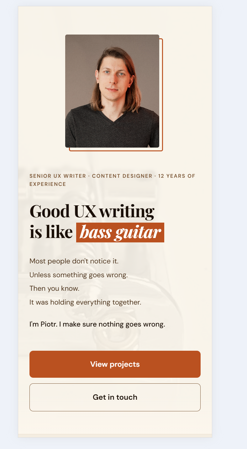
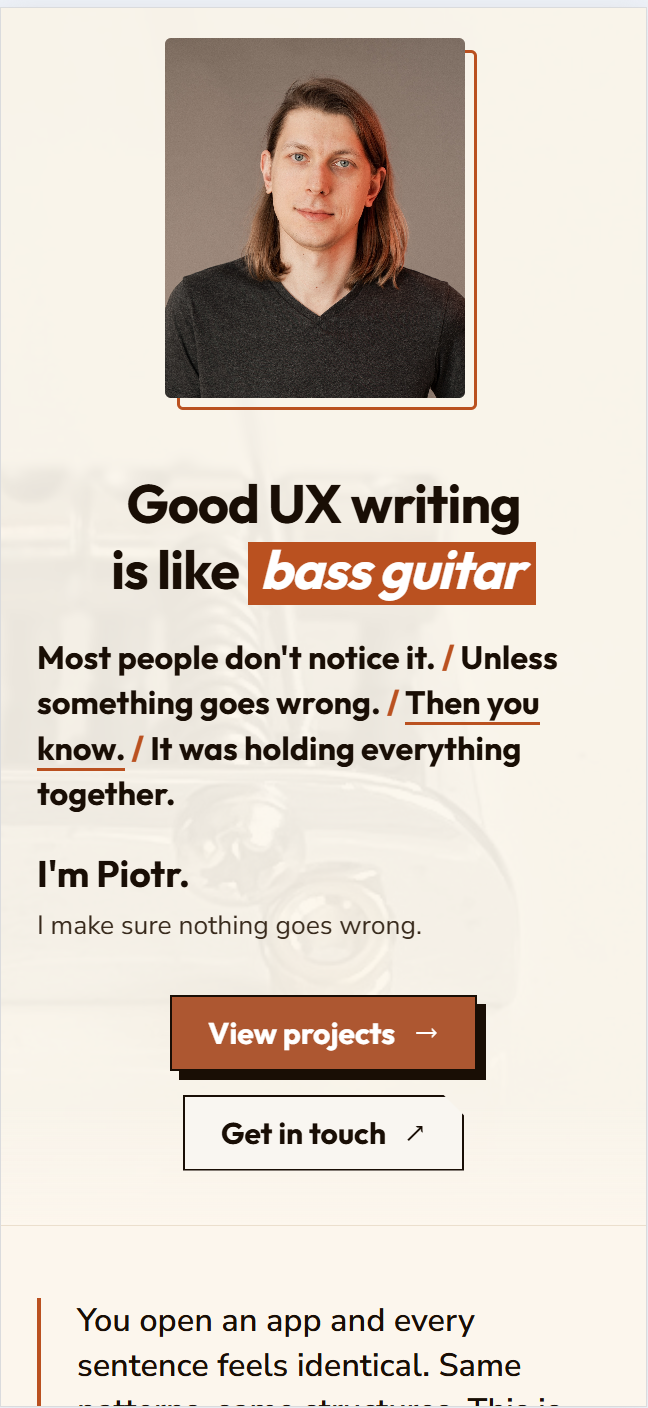
It turned out, writing is hard.
I'm a UX Writer. I help teams find the right words for their products. I simplify complex language, I write microcopy, I see details, I build content guidelines. And when I sat down to write my own hero section... I froze.
Can you relate?
Every sentence was suspicious. Too confident. Too vague. Too much like every other UX Writer's homepage. Not enough like me.
Perfectionism and imposter syndrome arrived at exactly the same time and sat down on both of my shoulders. No angels. Just two demons whispering in my ears.
Too bad I knew their tricks already.
The trap, I think, is specific to people who know what good writing looks like. The better your eye, the harder it is to accept your own draft as good enough. You can see exactly what's wrong with it. What you rarely can see is that "wrong enough to fix later" and "right enough to publish" are the same thing.
At some point I made a decision: let it go. Imperfect content on production is infinitely better than a perfect version that doesn't exist.
I published. The hero wasn't perfect. But it was mine. And the best part: It was live.
The invisible upgrade
The site was live. It loaded. The case studies were readable. The domain resolved. By any reasonable definition, the project was done.
Then I found Mikołaj Dobrucki's free course, Design with Code. I can't thank you enough, Mikołaj. Huge applause to this guy.
Design with Code — the course that made me rewrite a working website from scratch
I went in curious. I came out uncomfortable — in the best way. Because I now had vocabulary for something I'd felt but couldn't name: my site worked, but it wasn't well-built. The difference matters, and a UX Writer should understand it better than anyone. Words can work and still be the wrong words. Code can work and still be the wrong code.
I made a decision that's hard to justify rationally: I rewrote a functioning website from scratch.
The migration had two parts: the HTML architecture (to Astro) and the CSS (to Tailwind). Together, they took the site from "it works" to "it's properly done."
Why Astro
My original structure was a set of separate HTML files that shared almost nothing. Every time I updated navigation, I updated it in four places. Every case study was a copy of another case study with different content. Astro gave me components — update once, change everywhere. I had a content layer where case studies are Markdown files with frontmatter, not hand-edited HTML. It gave me a structure that scales.
The number I keep coming back to: migrating to Astro reduced my codebase by 59%. All of this just because I finally used the right tool.
Why Tailwind
Because Tailwind classes read like a description of appearance. flex gap-4 items-center isn't programmer notation — it's so much more. For someone who thinks in words first, this turned out to be a more natural way to style a page than writing CSS properties in a separate file.
I felt like I found a plain language version of written programming code. Fell in love immediately.
There's another reason Tailwind works particularly well in an AI-assisted workflow: AI loves its syntax. Tailwind classes are explicit, predictable, and self-contained — no cascade, no inheritance, no context needed. This means Claude Code generates Tailwind with far fewer errors than traditional CSS. You describe what you want, you get working code, first try. That alone changed the pace of iteration significantly.
The migration wasn't smooth. After switching to Tailwind, the site completely broke — all styles gone. The culprit was old CSS resets conflicting with Tailwind's Preflight. Classic migration trap. Diagnosed, fixed, done.
Final verdict on the whole migration: 100% success. Claude Code gets top marks.
Visitors to my site today don't see anything different from its previous version. Before the huge code update. The content is the same. The layout is essentially the same. The fonts are the same.
But the site now loads faster, ranks better in search, has a codebase I can actually maintain, lets me add content once and have it appear everywhere it should, and doesn't require me to touch four files every time I update a single component.
This is the part of the work that has no portfolio moment. There's no before/after screenshot. There's no visible proof.
It's the kind of improvement that matters most and shows least — which, again, a UX Writer should understand intuitively.
Or a bassist. Lucky me — I'm both. The best content work often looks like nothing happened.
One more thing — the design system
The code was clean. The texts were there. And yet I kept coming back to the site with a feeling that something was still off.
I couldn't name it for a while. Then I could: it looked like a template. Not like someone's own visual voice. Like something thousands of other people could have launched with three clicks. It hurt me
More than any typo ever could.
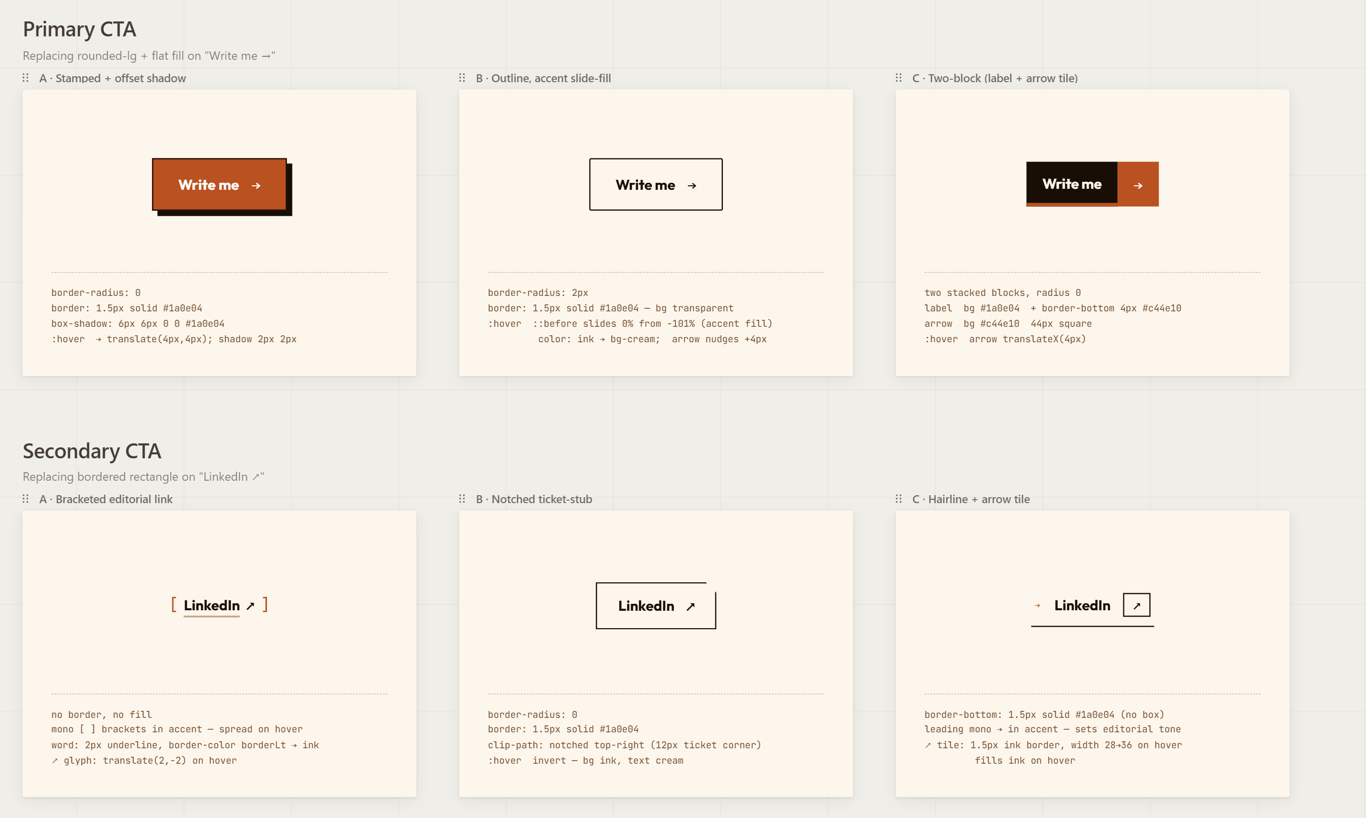
So I started working on components. And this is where the three AI tools I'd been using turned out to be genuinely complementary.
I showed Claude Design some existing components from the site and gave it criteria: the mood I was going for, the level of detail, the kind of impression I wanted to leave. Claude Design drew me stunning new components. Exactly what I had in mind.
Then I tried to feed those files directly to Claude Code.
Complete failure. Claude Design generates heavily bloated HTML that Claude Code simply can't process. The files were too large, too overloaded, and the whole thing collapsed. My Claude Code died.
The fix was simple once I saw it: take a screenshot of the component. Paste it into Claude chat. Ask it to describe the component and write a prompt for Claude Code. Then give that prompt to Claude Code.
Claude Code rebuilt the components from scratch — clean, lightweight, perfectly integrated with Astro and Tailwind. They're on the site today.
Claude Design output — beautiful but too heavy for Claude CodeRebuilt from scratch — clean, lightweight, on the site today
The final component library — every piece built through the screenshot → prompt → Claude Code loop
“No AI tool does everything. Each one does one thing well. The skill is knowing when to hand off to the next one.”
Results
01
59%
reduction in codebase size after migrating to Astro — no optimisation, just the right tool
02
One
solo owner — from discovery to maintenance
03
Zero
templates, builders, or frameworks used in v1
Time to answer the title question.
No. You cannot build a portfolio website in five minutes. You could generate a working page — maybe. But it wouldn't hold anyone's attention. And it would still need content. The real one.
And you certainly can't build one like mine. Integrated with Git. Deployed automatically through Netlify. Running through Cloudflare on a custom domain. Built on Astro with Tailwind. With case studies that actually say something.
What I learned
Done is better than perfect. And done is the only version that ultimately can become perfect.
You may ask why I'm writing this article. Not because I'm looking for a job — though I am.
But because for nearly 10 years I put off building a portfolio. Can you imagine? 10 years of "I'll do it properly when I have time." 10 years of watching other people launch their sites while I was still deciding on a stack. 10 years of listening to the demon of procrastination, knowing exactly what good looks like and using that knowledge as an excuse not to start.
What finally got me through it wasn't a better plan. It wasn't a perfect brief or the right tools or a free weekend. It was deciding that done matters more than perfect — and then sitting with the discomfort of publishing something I wasn't fully happy with.
Building a portfolio as a UX Writer feels uniquely hard because we know too much. We know what bad copy looks like. We know what an unconvincing hero says about a person. We know that "passionate about creating user-centered experiences" is the content equivalent of a vanilla shake.
And so we freeze.
I froze for ten years. And I'll be honest about what finally moved me: the launch of Claude Design. I'm not sure I would have started at all without the rise of AI tools that made the technical side feel approachable for the first time. That's not a disclaimer — it's part of the story.
Then I built the thing.
Then I rebuilt it better.
And maybe one person reads this and decides that today is the day they finally start.